
ANTI-GALLERY
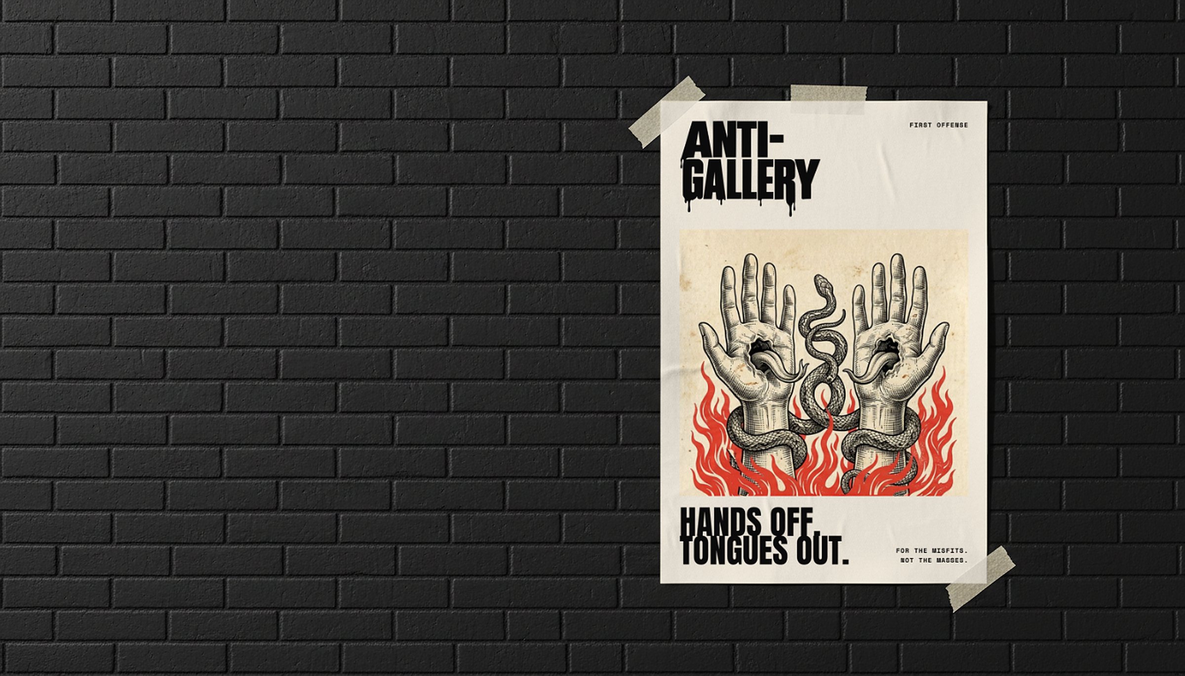
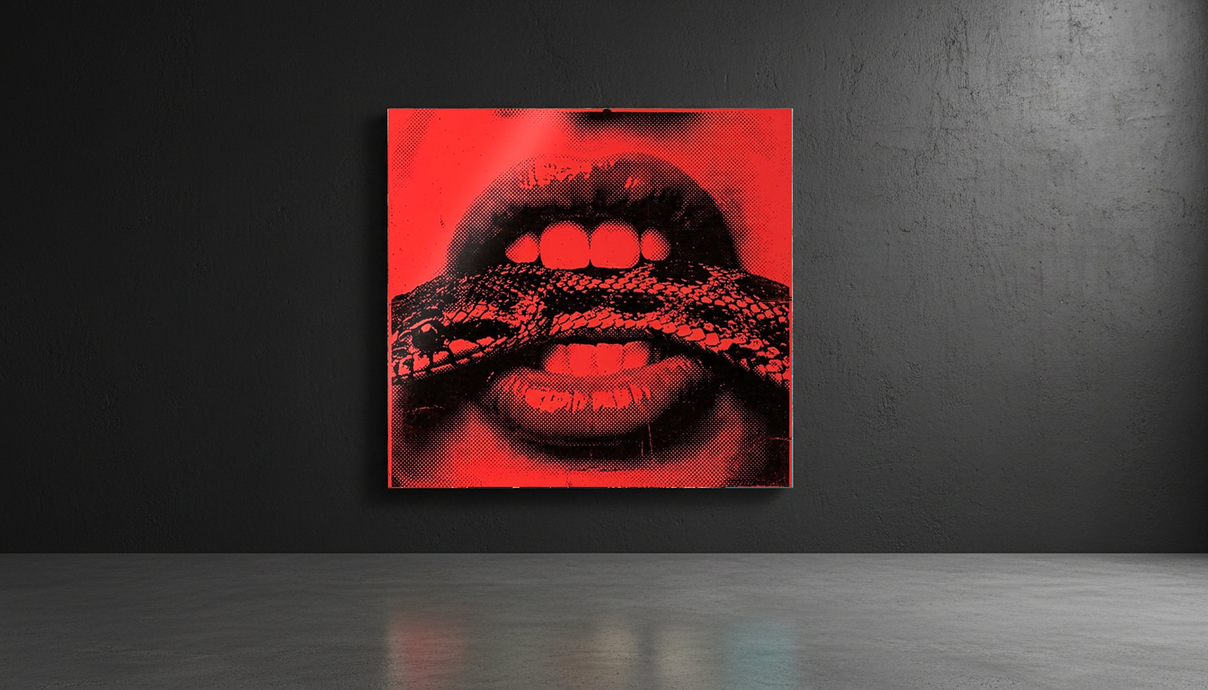
ANTI-GALLERY sells loud, strange art to people who never felt at home in a gallery. Each piece takes a familiar icon and messes with it, from a panther in tattoo flash to a pair of lips biting down on a snake.
The brand was starting from nothing. No followers, no website and no first sale. And the art itself made the job harder, because it changes style from one piece to the next. ANTI-GALLERY needed an attitude strong enough to hold every piece together, and a system tight enough that a stranger could spot one of its posts, boxes or pages before reading the name.
Approach
I started with the voice, before any visuals. Six pairs set the tone: bold, not polite. Curious, not conventional. Playful, not safe. Irreverent, not insulting. Cultural, not confined. For the misfits, not the masses.
That last pair became the tagline, and every design decision after it had to hold up against that line.
Identity
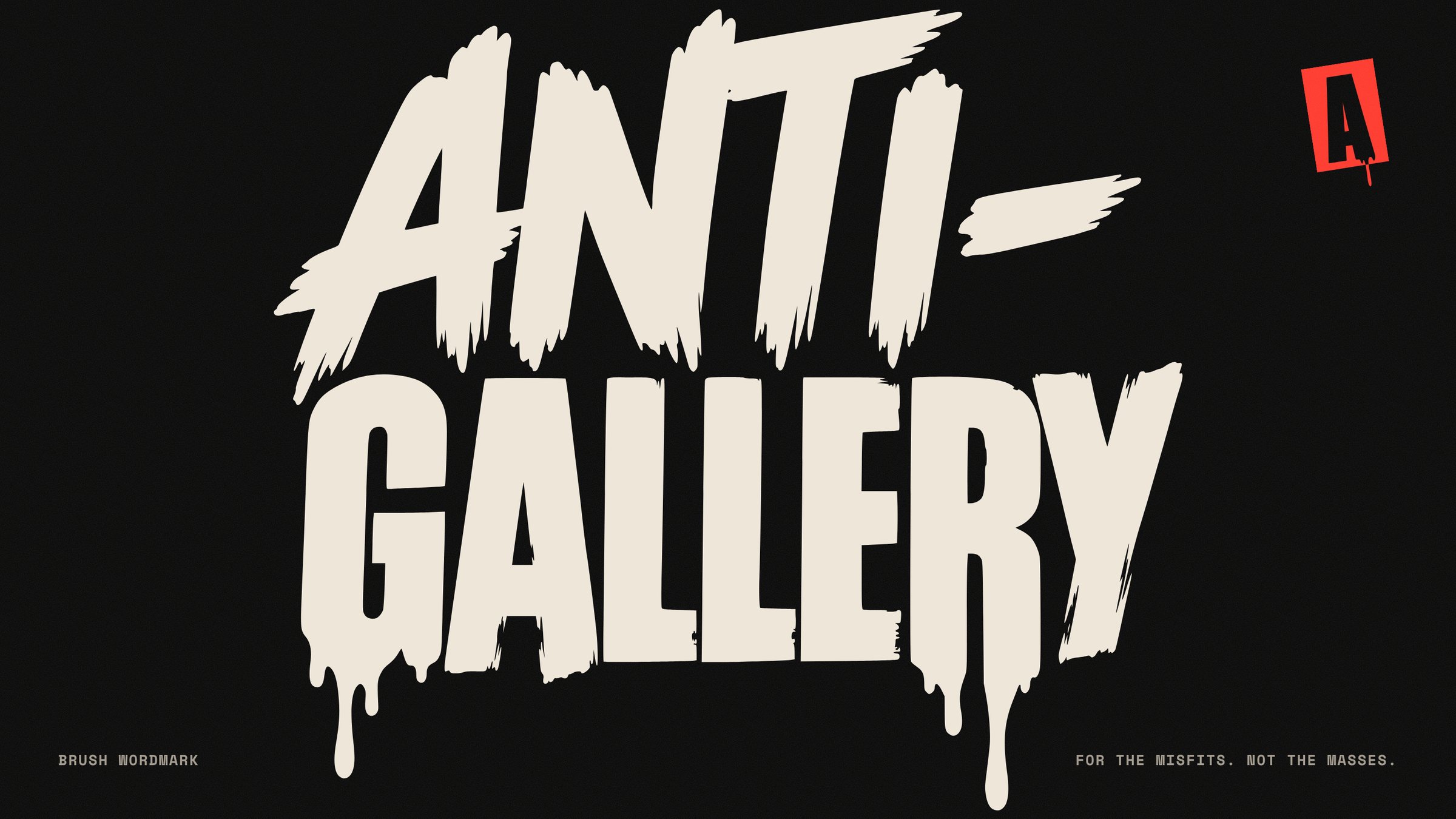
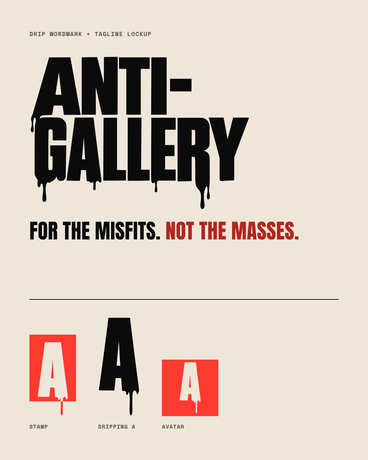
The wordmark comes in three levels of mess. Brush for the big moments, drip for everyday use and solid for small print, where drips would fill in.
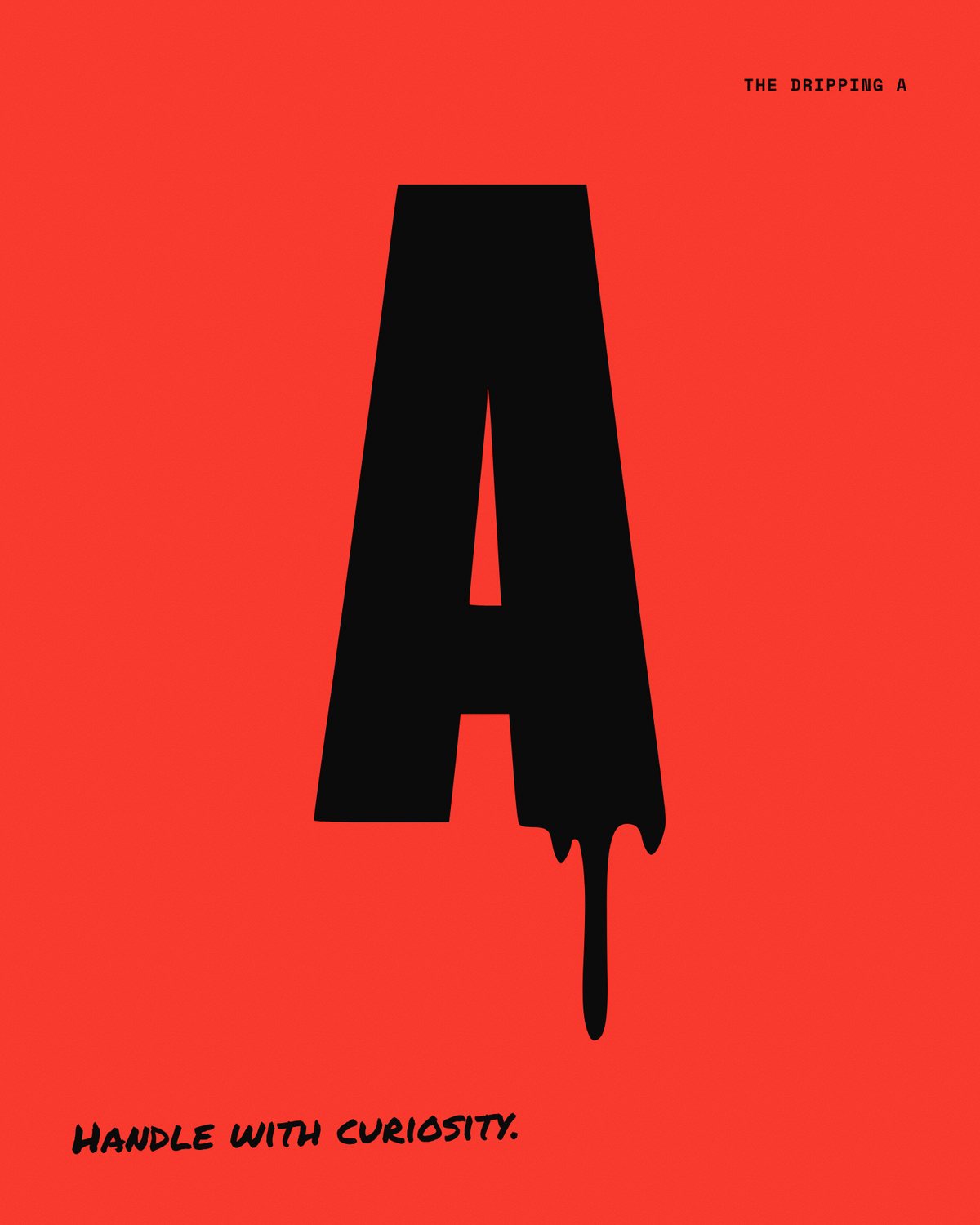
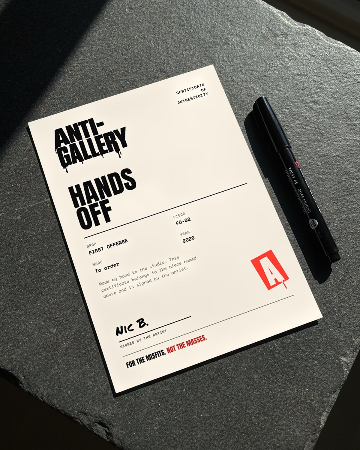
The dripping A, lifted from GALLERY, became the symbol. It works as a stamp on boxes, tape and certificates, and as the avatar on every social account.
Colour, type and art direction
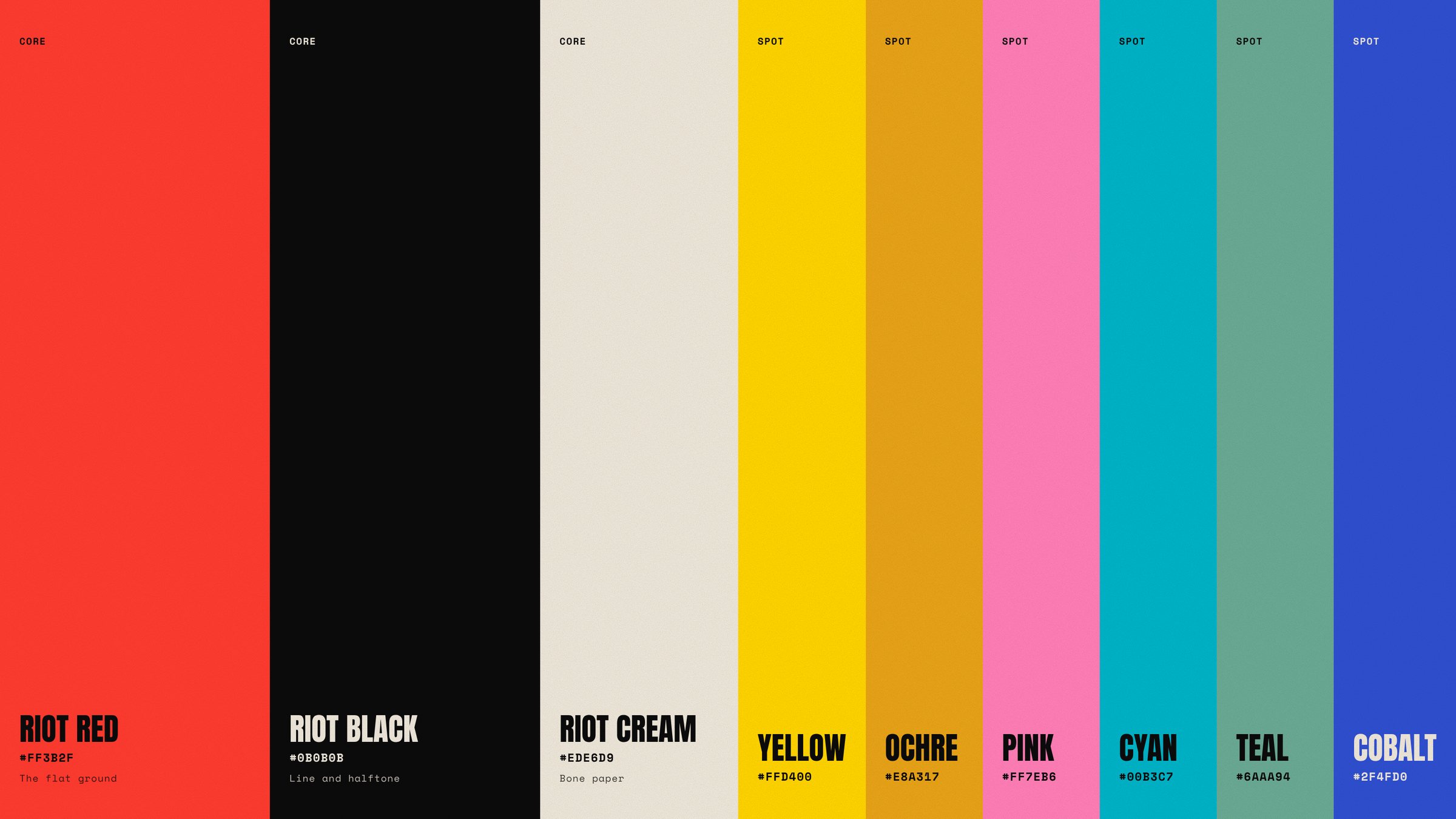
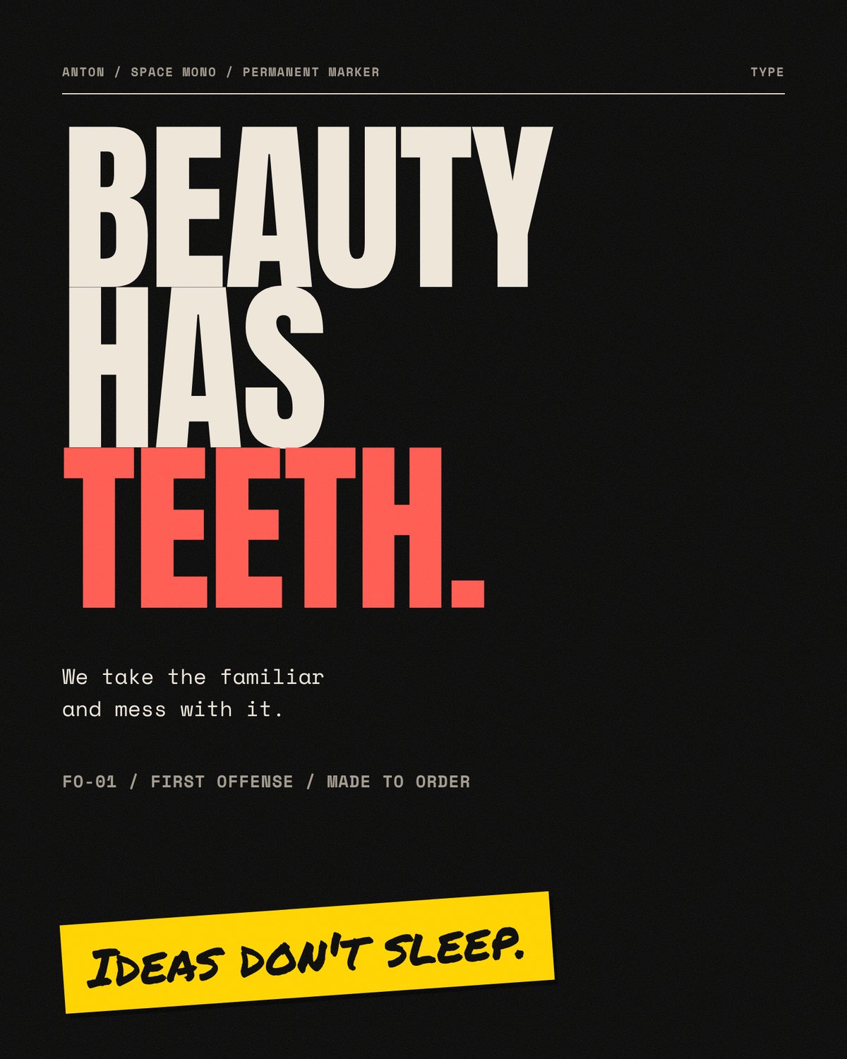
The interface stays black and cream so the art brings the colour. The brighter screenprint inks belong to stickers, tape and social, and never to buttons. Three typefaces each get one job. Anton shouts, Space Mono explains and Permanent Marker is the artist's hand.
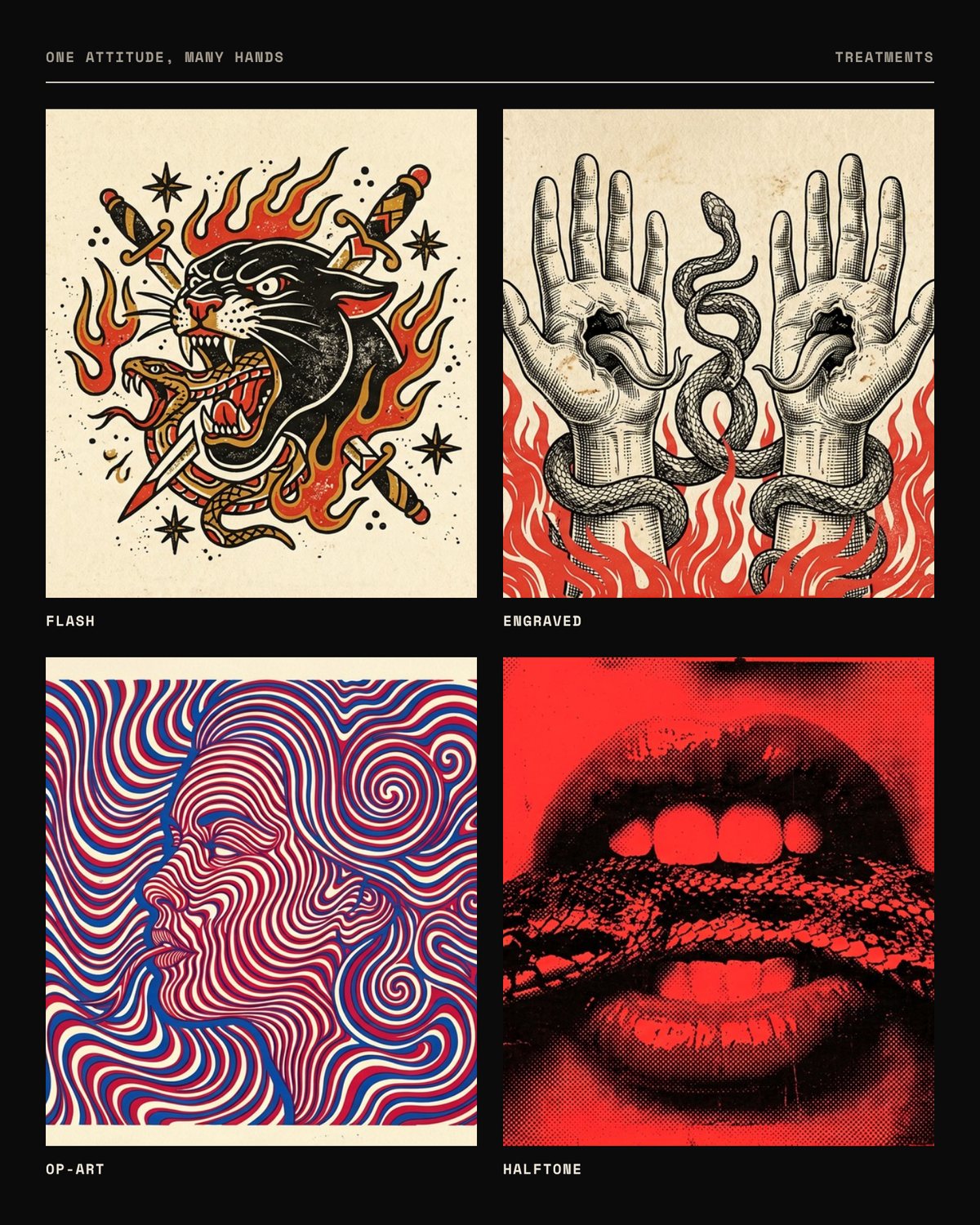
For the art, I defined five treatments, from tattoo flash to op-art, and one set of rules every piece shares: one subject on a flat ground, two to four inks and a bite. That gives the artist room to change style without the brand losing its shape.
Packaging and print
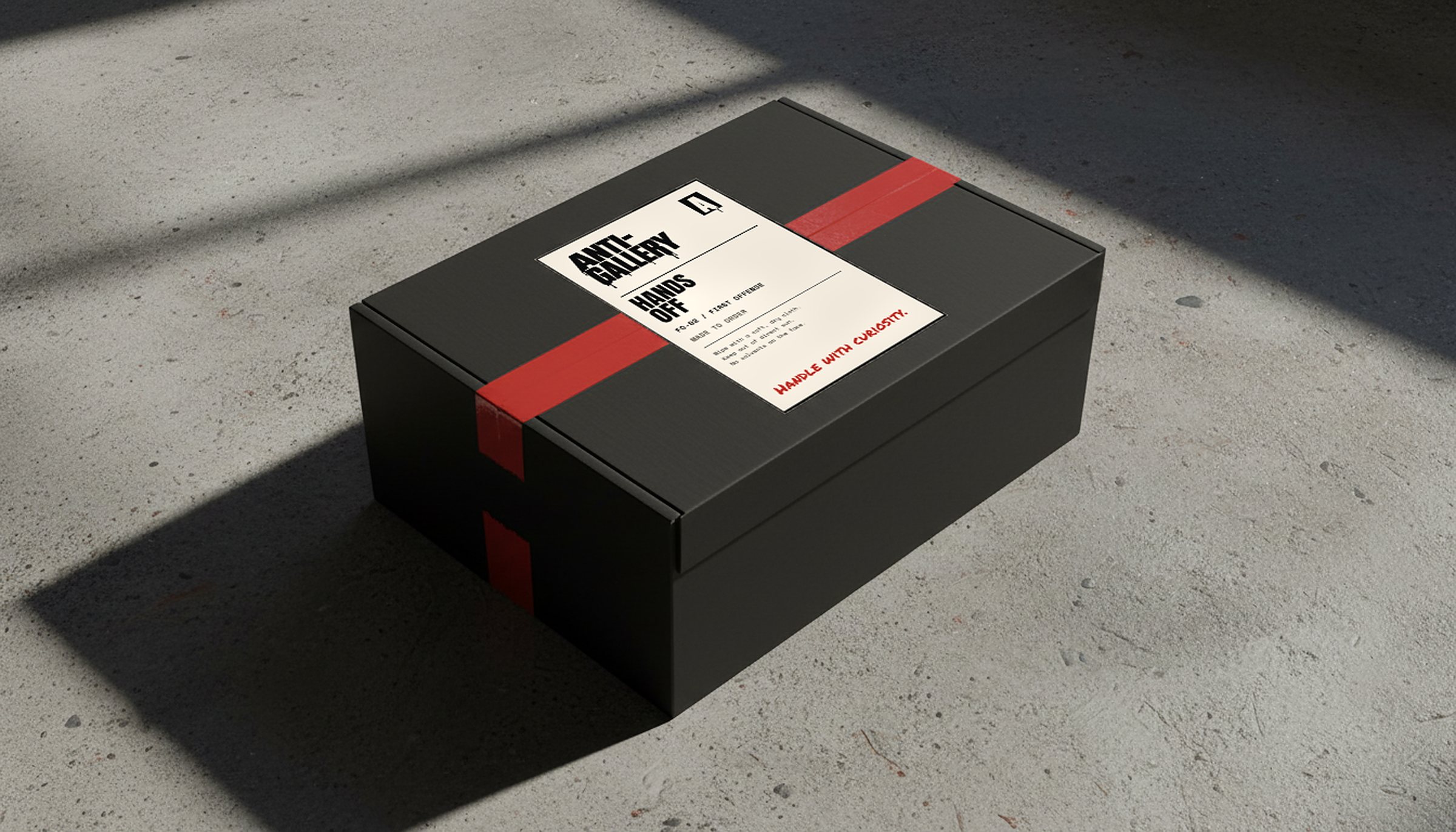
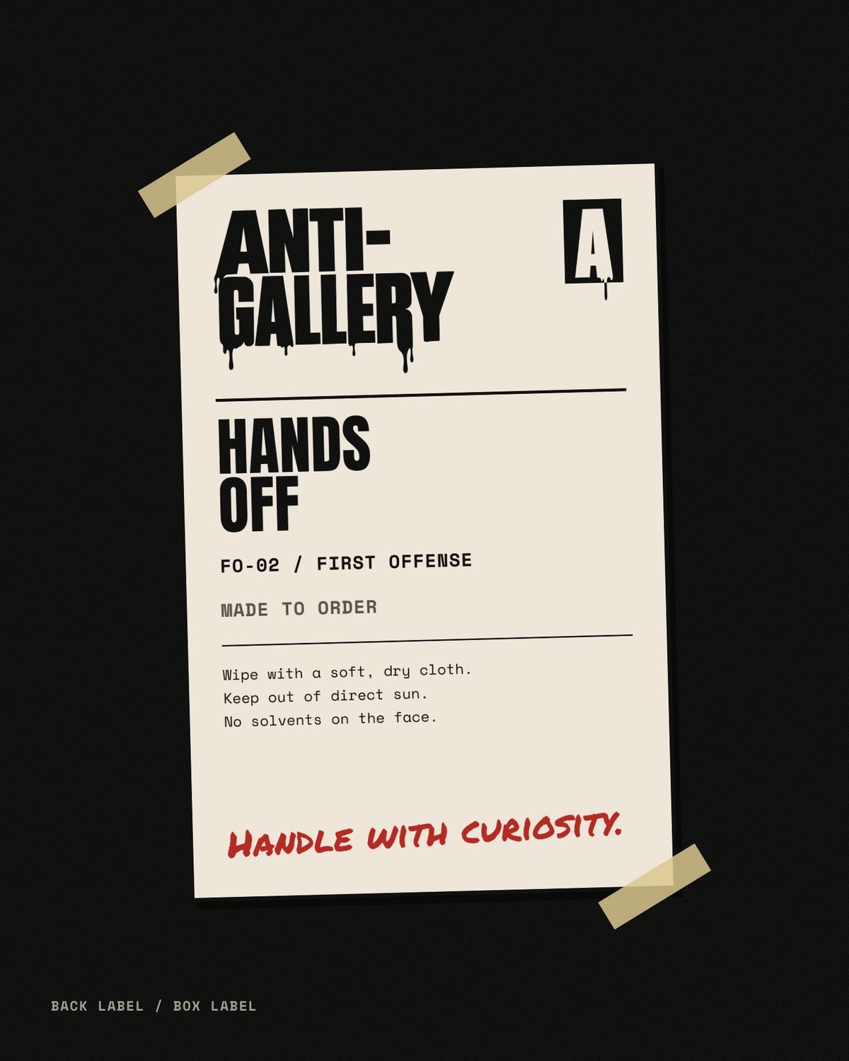
Every piece is made to order, so opening the box should feel like the moment it was made for you. A black box sealed with red tape, a back label with care notes and a hand note that says handle with curiosity.
We chose not to number editions. The certificate of authenticity names the piece and the drop, and the artist signs every one by hand.
Launch
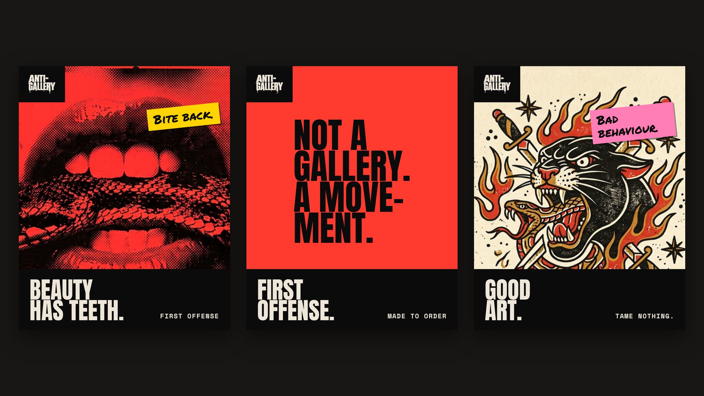
With no audience yet, the launch starts on Instagram and Facebook, with a new post every day for 30 days. Each post and banner promotes the brand and the idea, and the selling comes later.
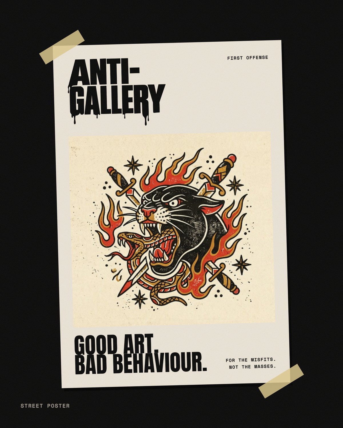
I built templates for posts, banners and street posters. The wordmark sits on a black plate, one line does the talking and the art fills the frame. The artwork changes daily and the frame stays the same, so the feed reads as one brand from the first week.
Website
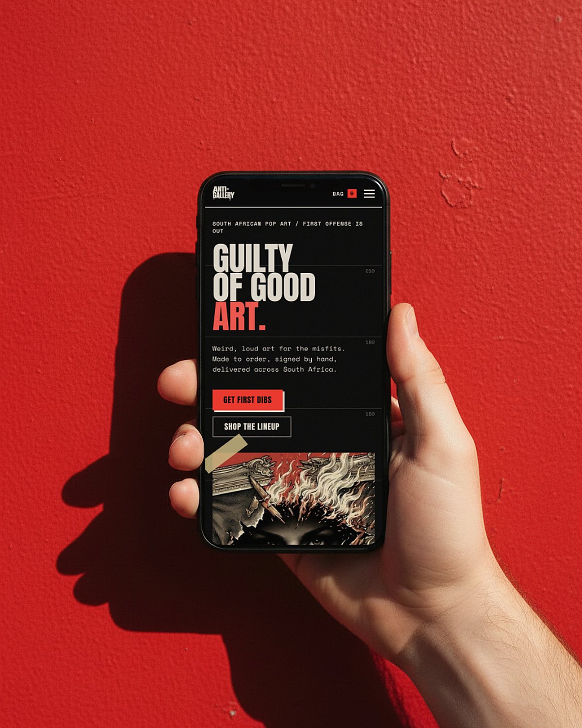
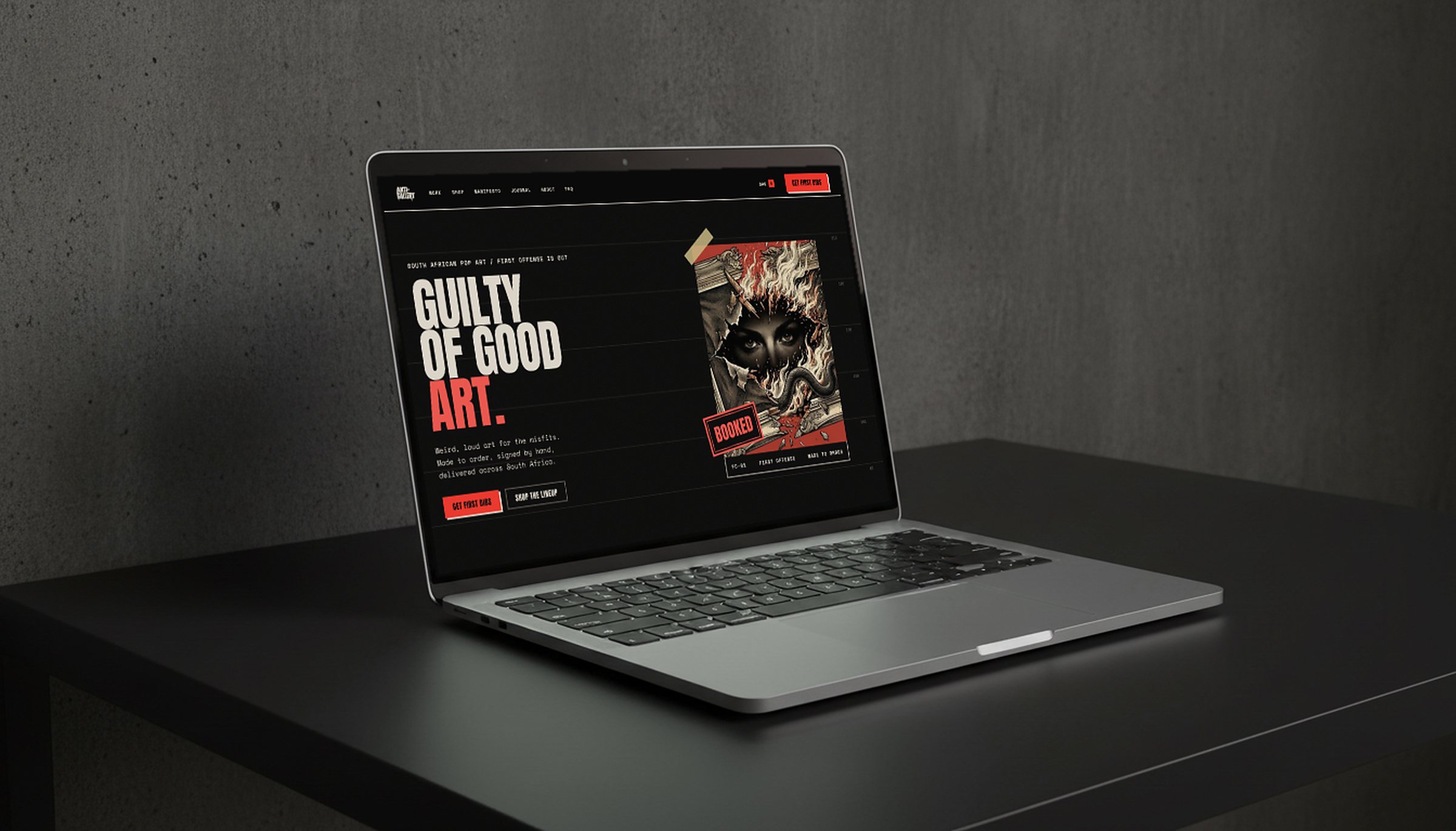
I explored several concepts for the site and landed on a case file. Drops are offenses, the work is the evidence and the shop is a lineup, with the hero piece booked like a mugshot.
The joke lives in the headlines only. The menu uses plain words, and one sign-up button, GET FIRST DIBS, appears on every page. A visitor who has to decode the navigation never joins the list.
Outcome
- A complete brand system, from logo suite and voice to colour, type and art direction rules, kept as a living design system.
- Packaging, labels and a certificate of authenticity ready for the first drop, FIRST OFFENSE.
- Thirty days of launch content, banners and street posters for Instagram and Facebook.
- A full website design for a WordPress build that launches with the brand and email list first, then the shop.
Looking back
The hardest part was deciding where the rebellion stops. A brand built on breaking rules still needs rules, and most of the work went into drawing that line.
The art, the headlines and the stickers can say whatever they like. The menu, the checkout and anything a buyer needs to trust stay plain and clear.
Book a call and tell me where the business is going. I'll show you the clearest way to get there.
→Book a call