

A dentist kids actually look forward to.
A family-friendly practice given a warm, playful identity that takes the fear out of the dentist, for children and parents alike.
- Client
- McKechnie Dental
- Industry
- Family & Paediatric Dentistry
- Services
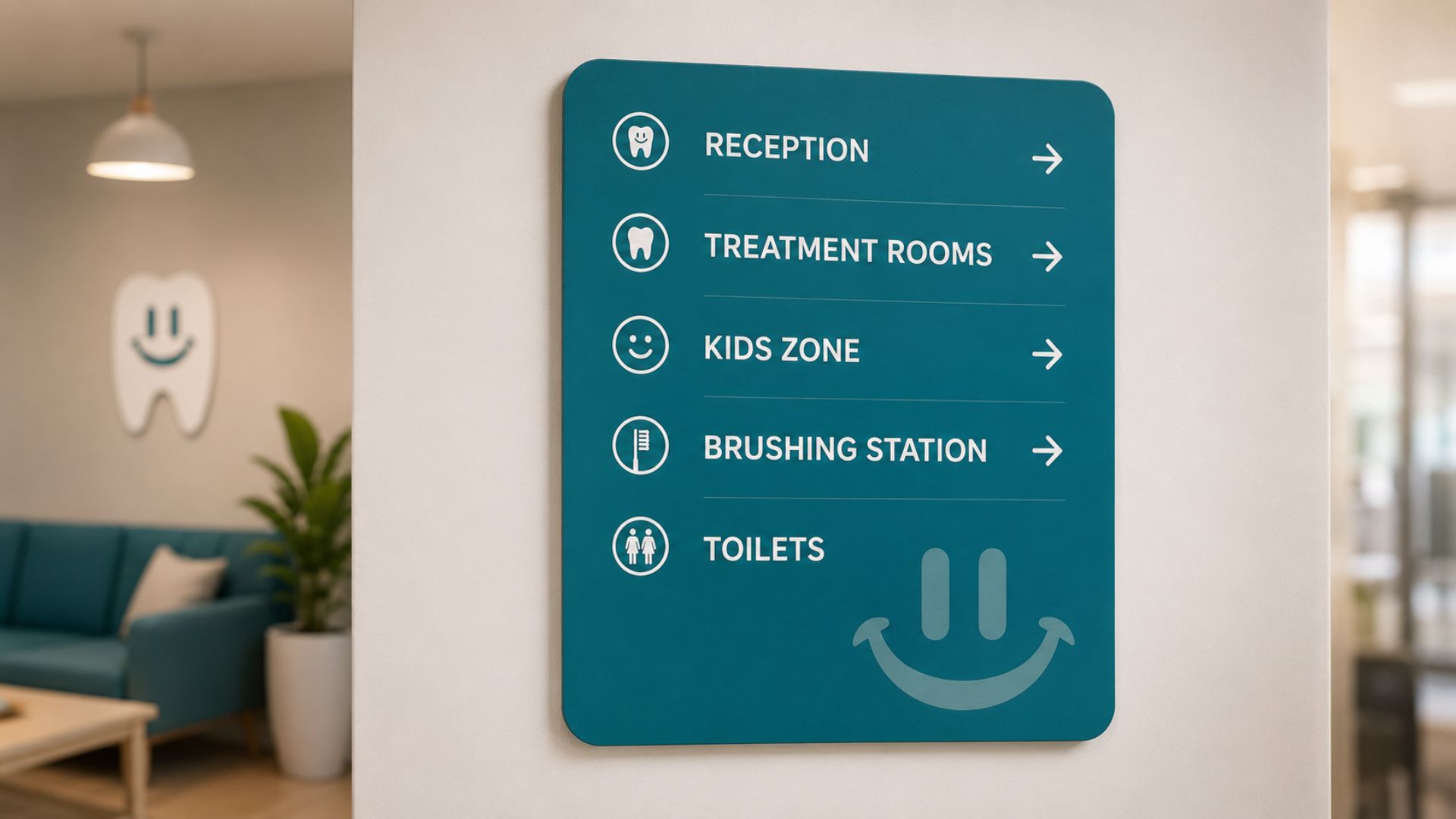
- Logo Design, Business Stationery, Signage Design
- Year
- 2026

The brief
McKechnie Dental is a family practice built around children. Their whole reason for being is to make dental visits feel safe and friendly, the opposite of how most kids feel about the dentist. They came to me to build a brand identity that would do the same job their team does every day: take the apprehension out of the room. It needed to feel approachable and trustworthy to children and parents at the same time.
The challenge
The hard part was balance. The brand had to feel fun, friendly and inviting without losing the professionalism a parent needs to see before they trust you with their child. Too playful and it reads as a toy. Too clinical and it brings back every reason kids dread the chair. It had to make a dental visit feel like something to look forward to, while still saying, clearly, that this is a serious practice doing serious work.
The approach
I started where the anxiety starts. What actually makes children nervous about the dentist, and what reassures the parent standing next to them? The answer pointed straight at minimalism. A brand that was clean enough to feel calm and capable, but warm enough to feel human. Simple, soft shapes. Welcoming colours. Every decision made to lower the temperature in the room before anyone even walked in.
The execution
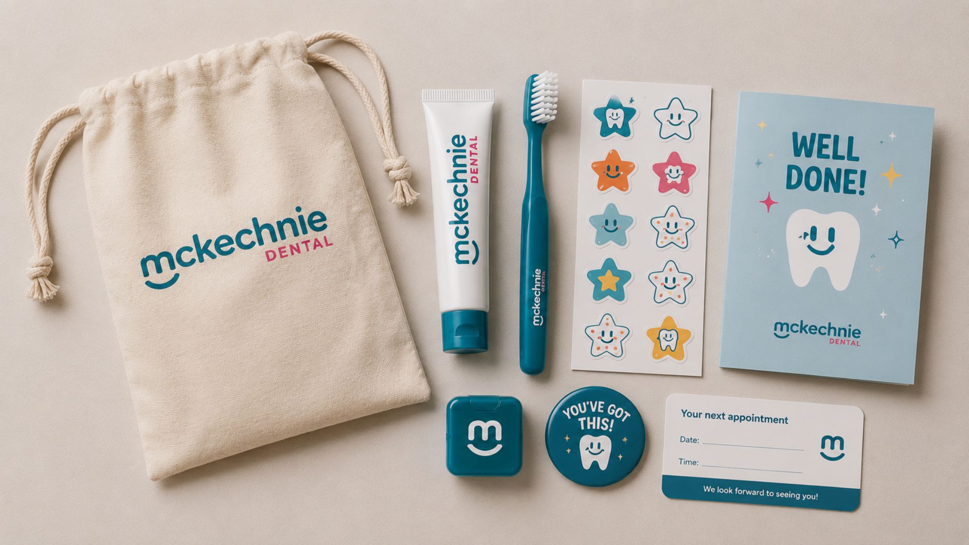
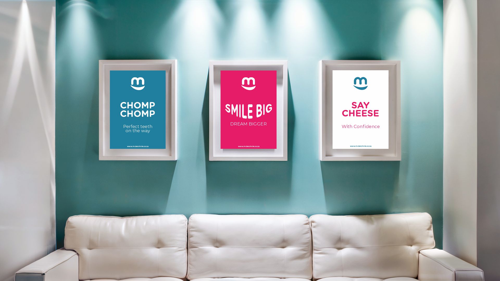
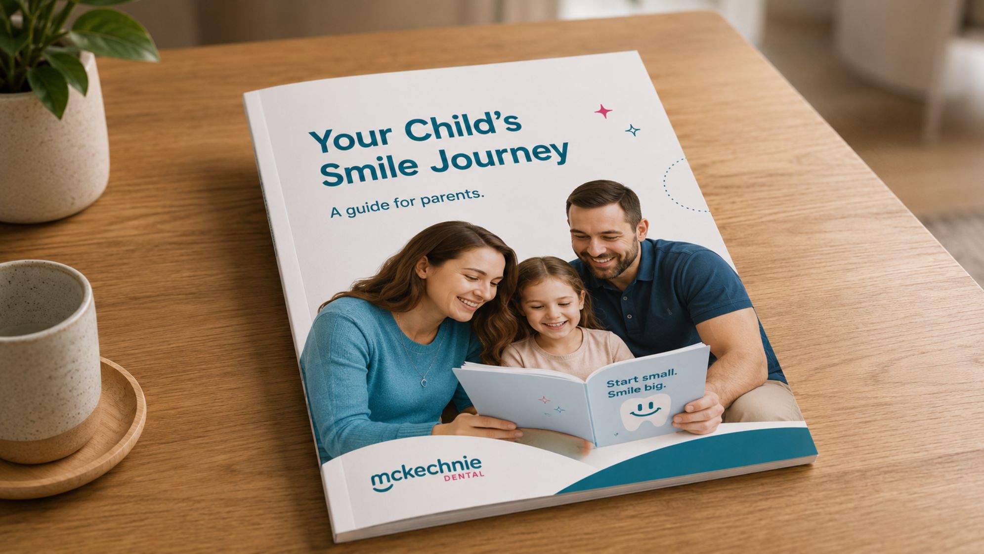
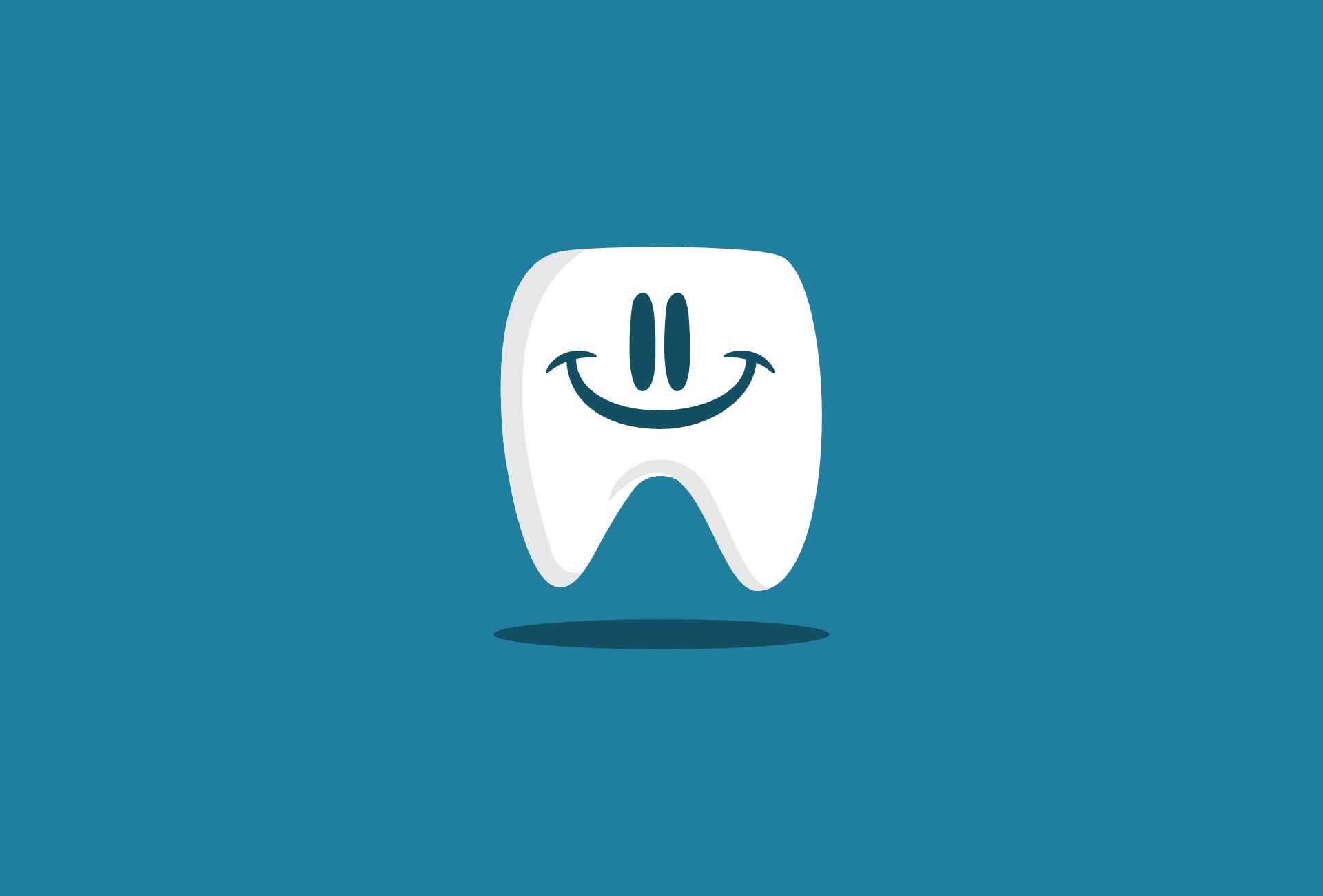
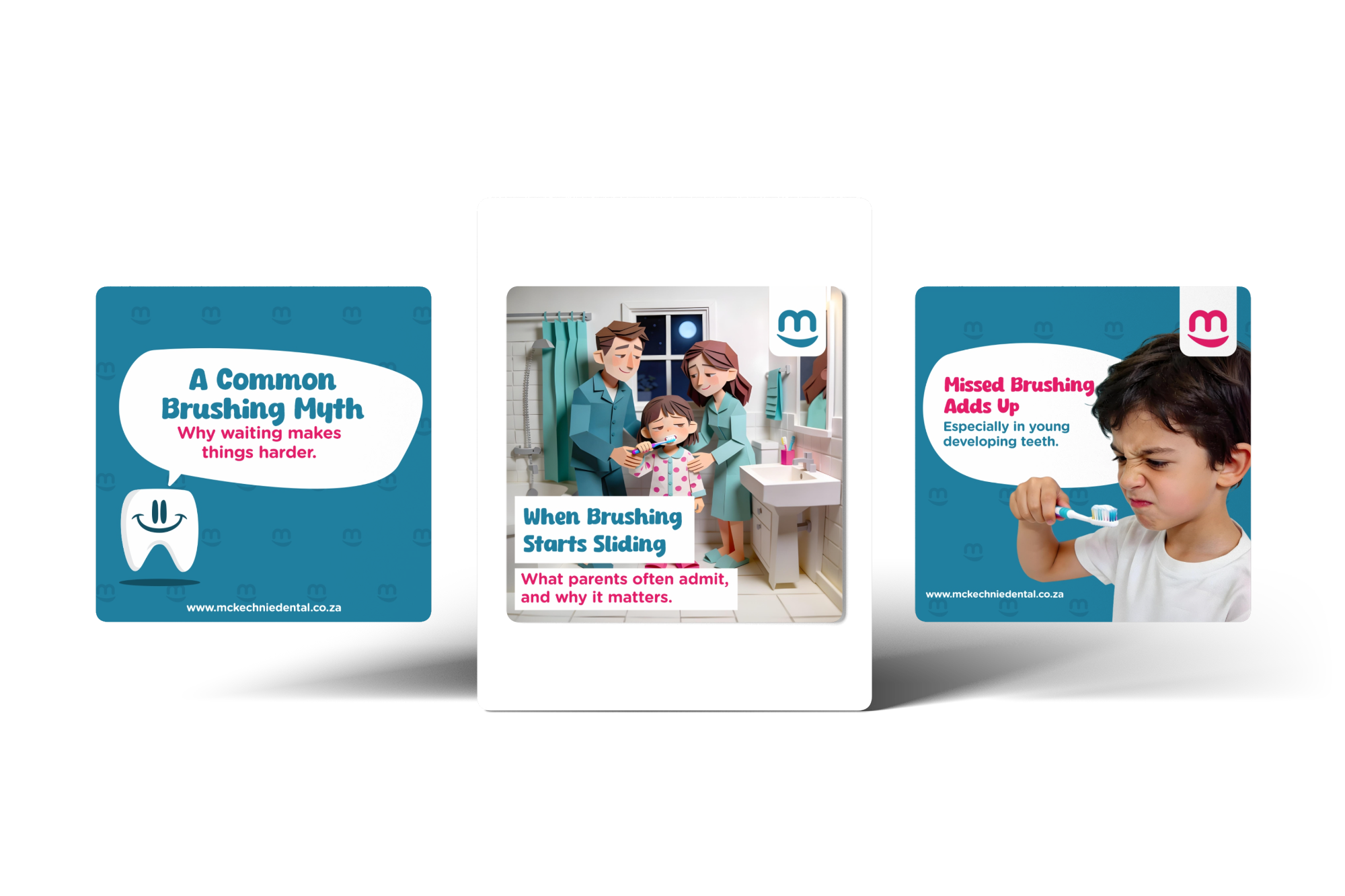
The logo led everything. Gentle curves and a rounded, friendly wordmark to project warmth, with a stylised happy tooth worked in so it felt fun but never silly. From there I built out the identity across business stationery and signage, all carrying the same minimal, friendly tone. The palette did a lot of the heavy lifting: soft, soothing tones as the base, with pops of playful colour for energy. Calm and fun, holding hands.
The outcome
McKechnie Dental ended up with a brand that reflects how the practice actually feels to walk into. Friendly enough to put a child at ease, polished enough to earn a parent's trust, and consistent across every touchpoint from the front desk to the wall signage. A practice that turns a visit kids used to fear into one they look forward to.
Good branding doesn't shout. Sometimes it just helps a nervous kid relax.