
Lead Projects
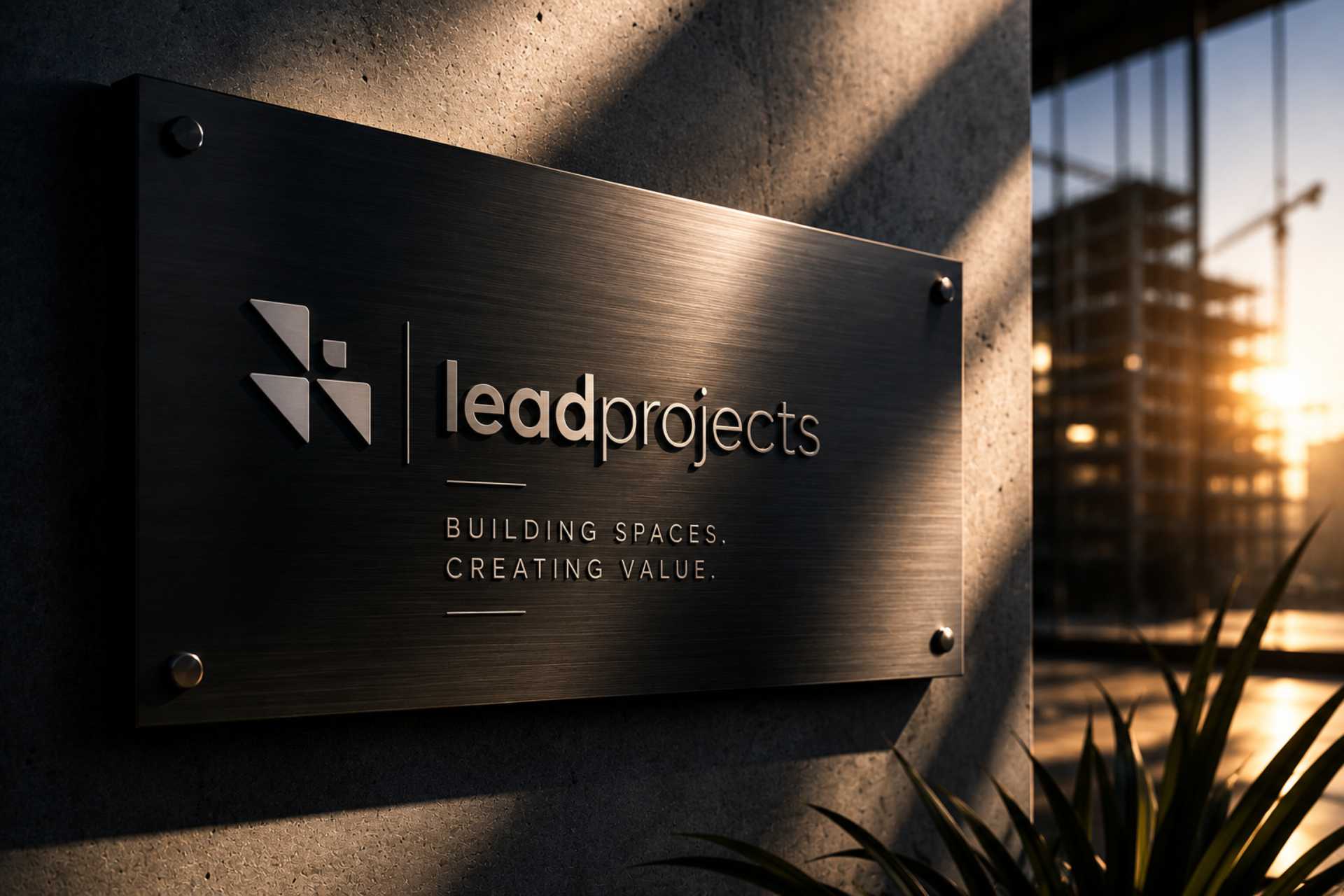
Built to lead, now looking the part.
Lead Projects manages large-scale projects, the kind where a lot is riding on getting it right. They weren't short on capability. They were short on a brand that matched it. Their industry moves fast and shifts often, and they needed an identity that reflected the forward-thinking way they actually run a project. The goal was simple. Make the brand look as considered as the work behind it.

The challenge
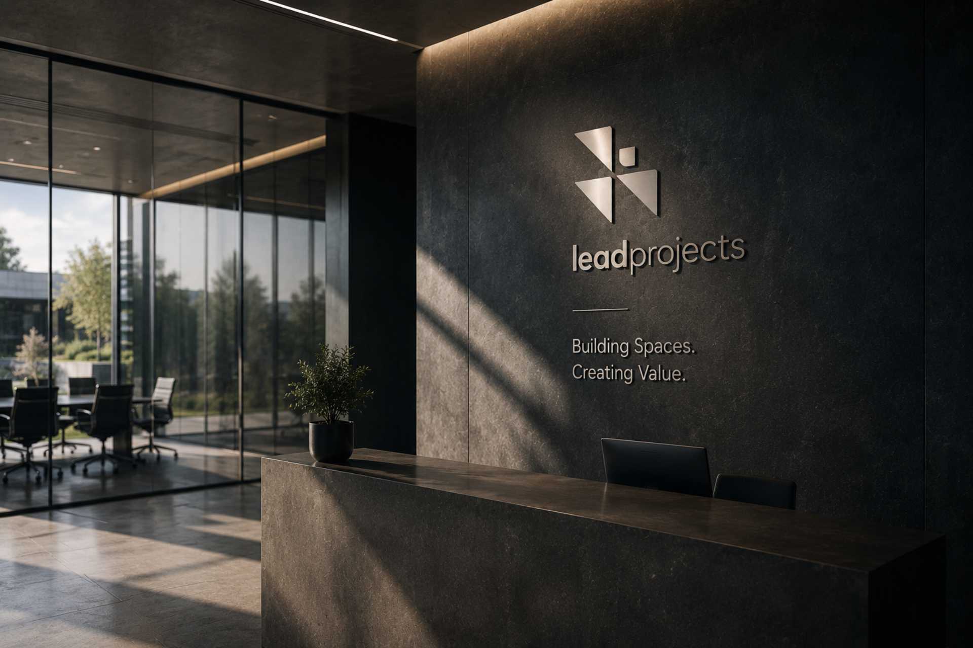
Large project management firms tend to blur together. Same promises, same look, same language. Lead Projects faced the usual suspects: a crowded field, no obvious way to stand apart, and clients whose expectations keep moving. On top of that, the brand had no real narrative holding it together. Nothing that explained, at a glance, why they were different or worth choosing.
The approach
I started by listening. Working closely with the Lead Projects leadership, I ran an assessment of where the brand sat in its market and who it was really talking to. That groundwork mattered. You can't set a business apart if you don't understand it first. It gave me a clear read on their positioning and audience, and from there, a brand strategy built specifically for them rather than borrowed from the firm down the road.

The execution
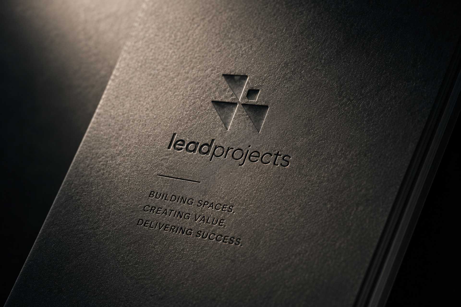
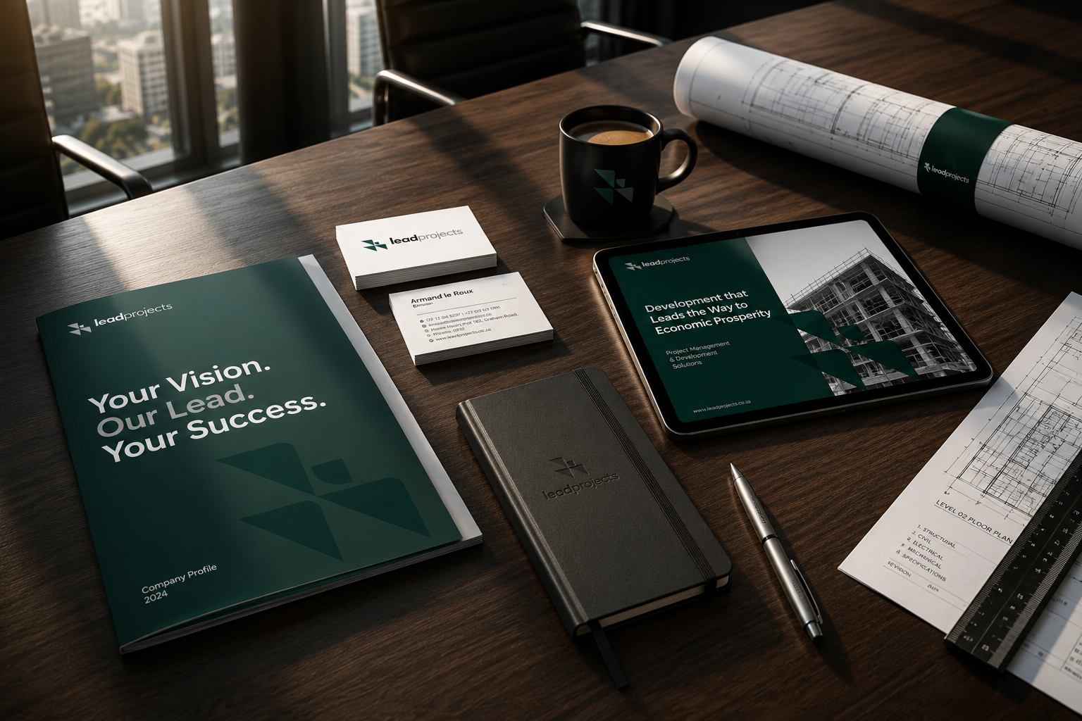
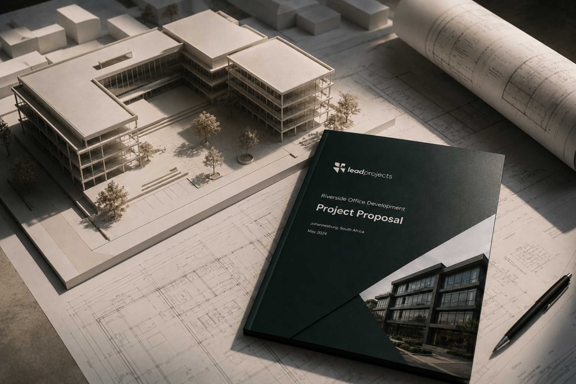
The strategy turned into something you could see and use. A distinctive logo to anchor the identity. Business stationery that carried the brand consistently across every document and touchpoint. And a set of brand guidelines so the whole thing held together no matter who was using it or where it showed up. Considered, consistent, and built to scale with the business.
Outcome
In a crowded industry, the clearest brand wins. Not the loudest one.
Lead Projects came away with a brand that finally pulls its weight. An identity that sets them apart in a lookalike industry, a clear story behind it, and the assets to put it to work everywhere. A firm built to lead, now looking the part.
Book a call and tell me where the business is going. I'll show you the clearest way to get there.
→Book a call