
Transnational Logistics
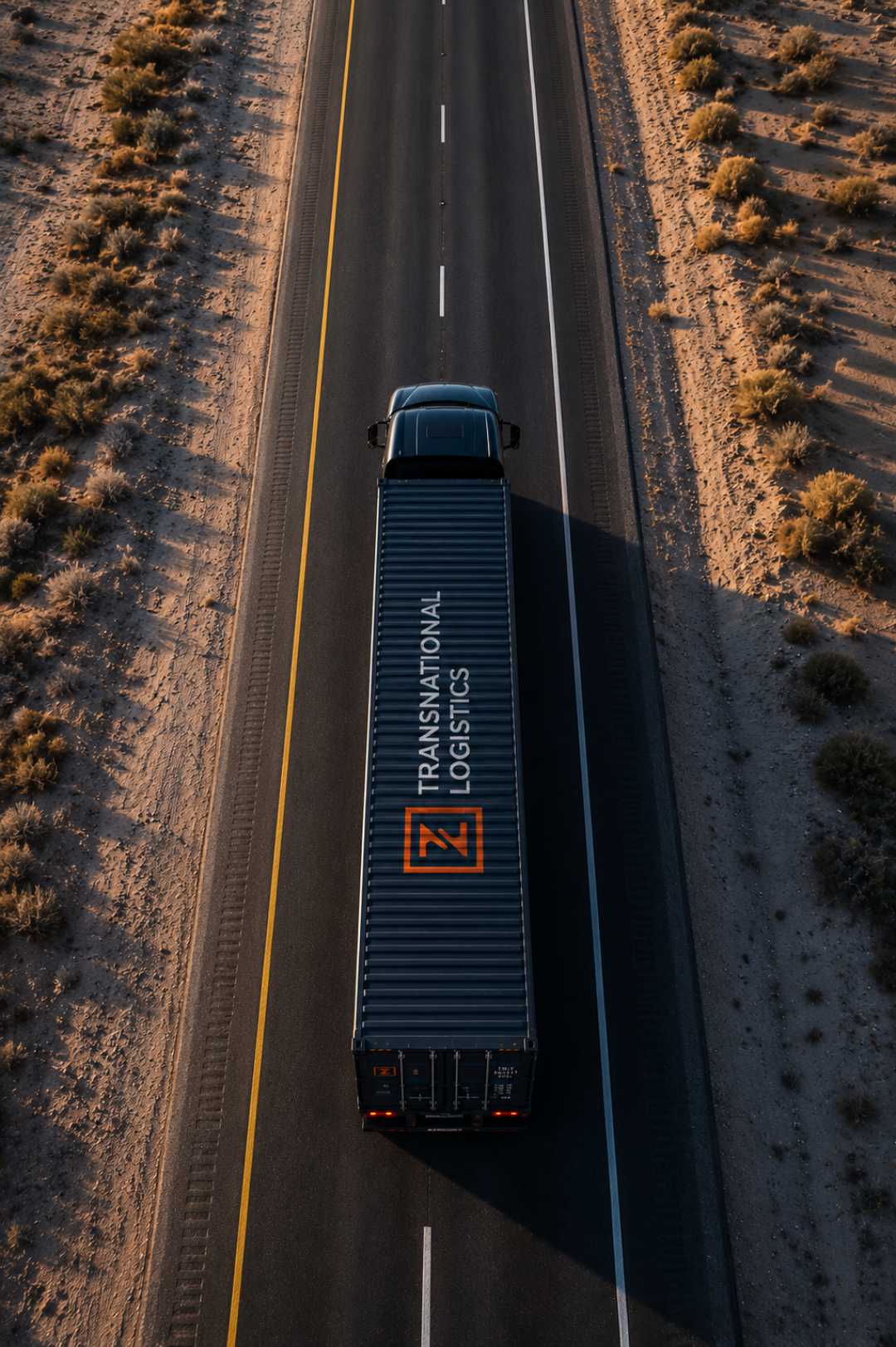
A logistics brand rebuilt to move with them.
When imports and exports were put on hold during the pandemic, the whole industry felt it. Transnational Logistics came out the other side of lockdown ready to rebuild, and they came to me to give the business a brand that matched where it was heading. Not a touch-up. A proper reset for a company stepping into its next chapter.

The challenge
There wasn't much to build on. The only thing they had was a logo that looked like a near-copy of another company's, no stationery, and no online presence at all. For a business that moves goods across borders, being invisible and easy to confuse with someone else is a real problem. This had to be a complete rebrand, from the ground up.
The approach
Before drawing anything, I worked out where they actually fit. Who they serve, what they do better than the rest, and how to say it in a way that sounds like them and no one else. That positioning became the brief for everything that followed, so each piece pulled in the same direction instead of being designed in isolation.

The execution
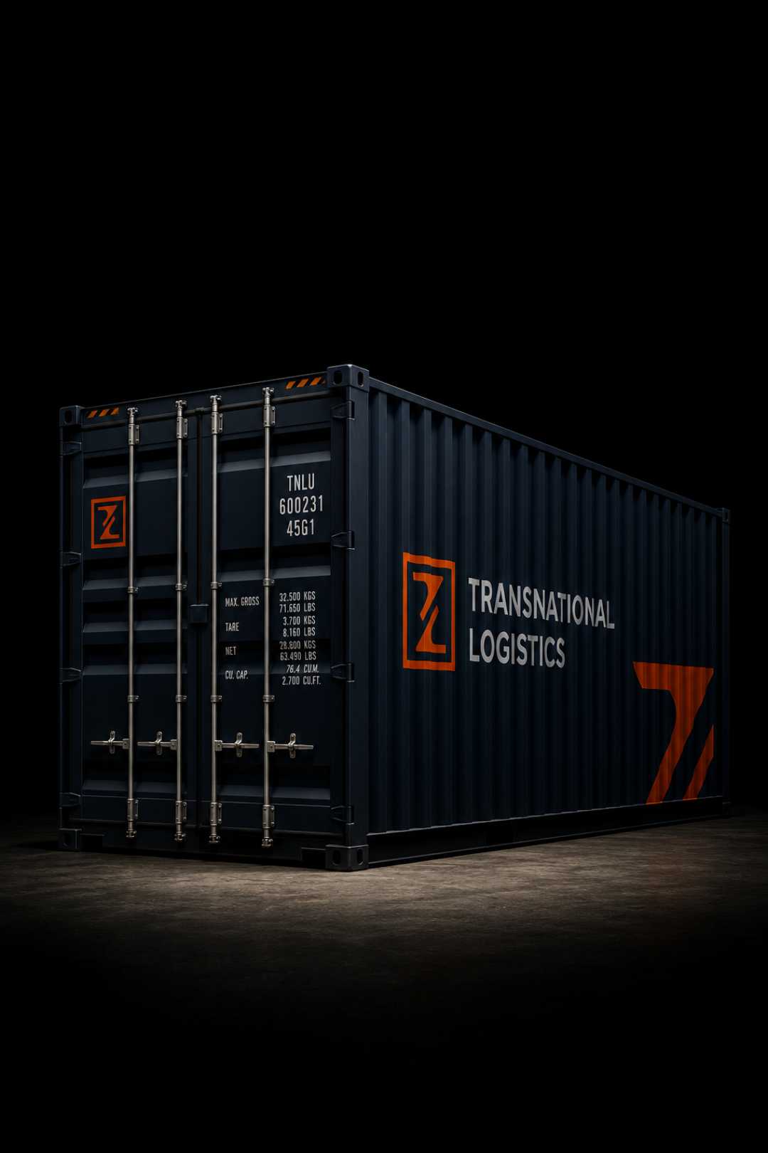
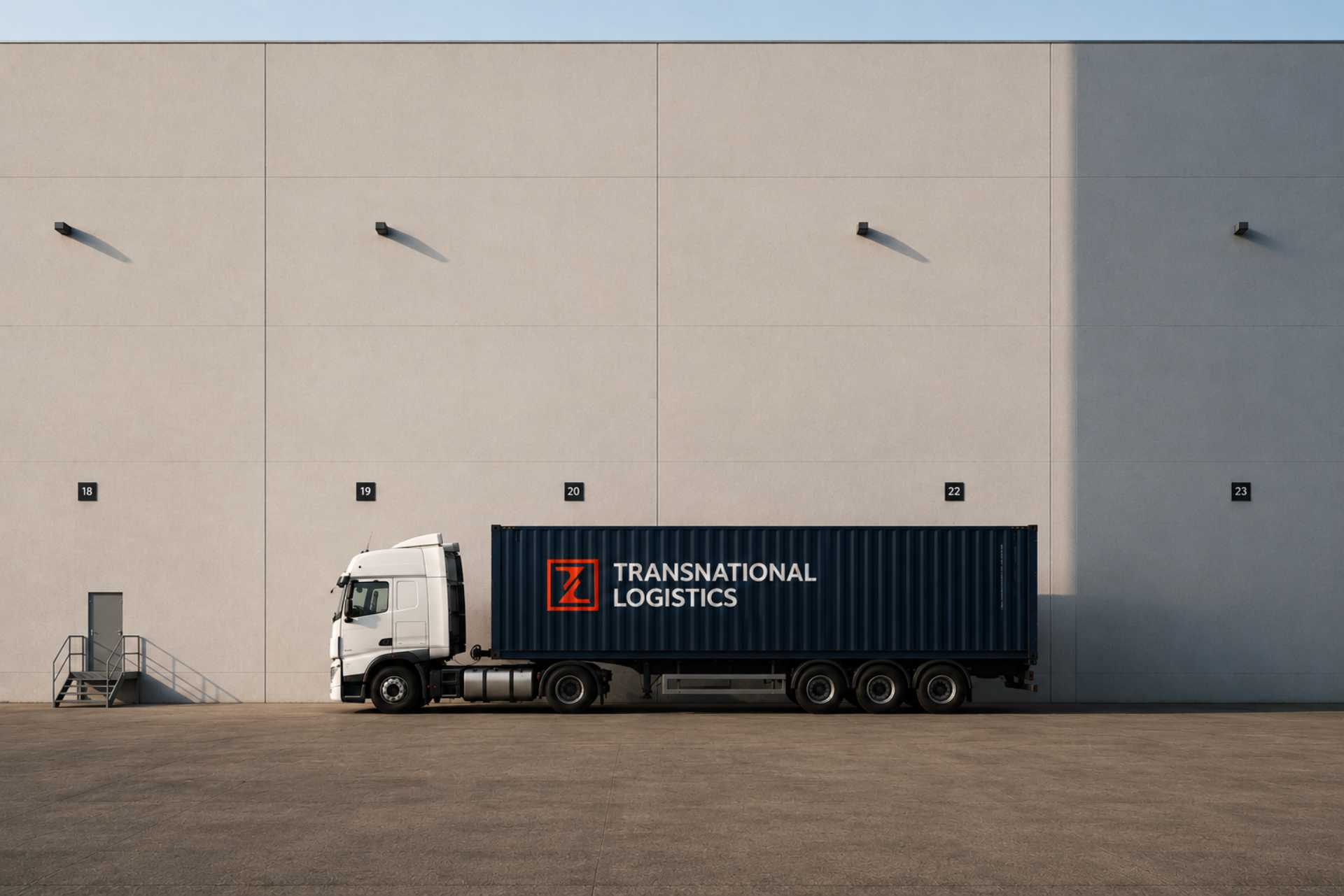
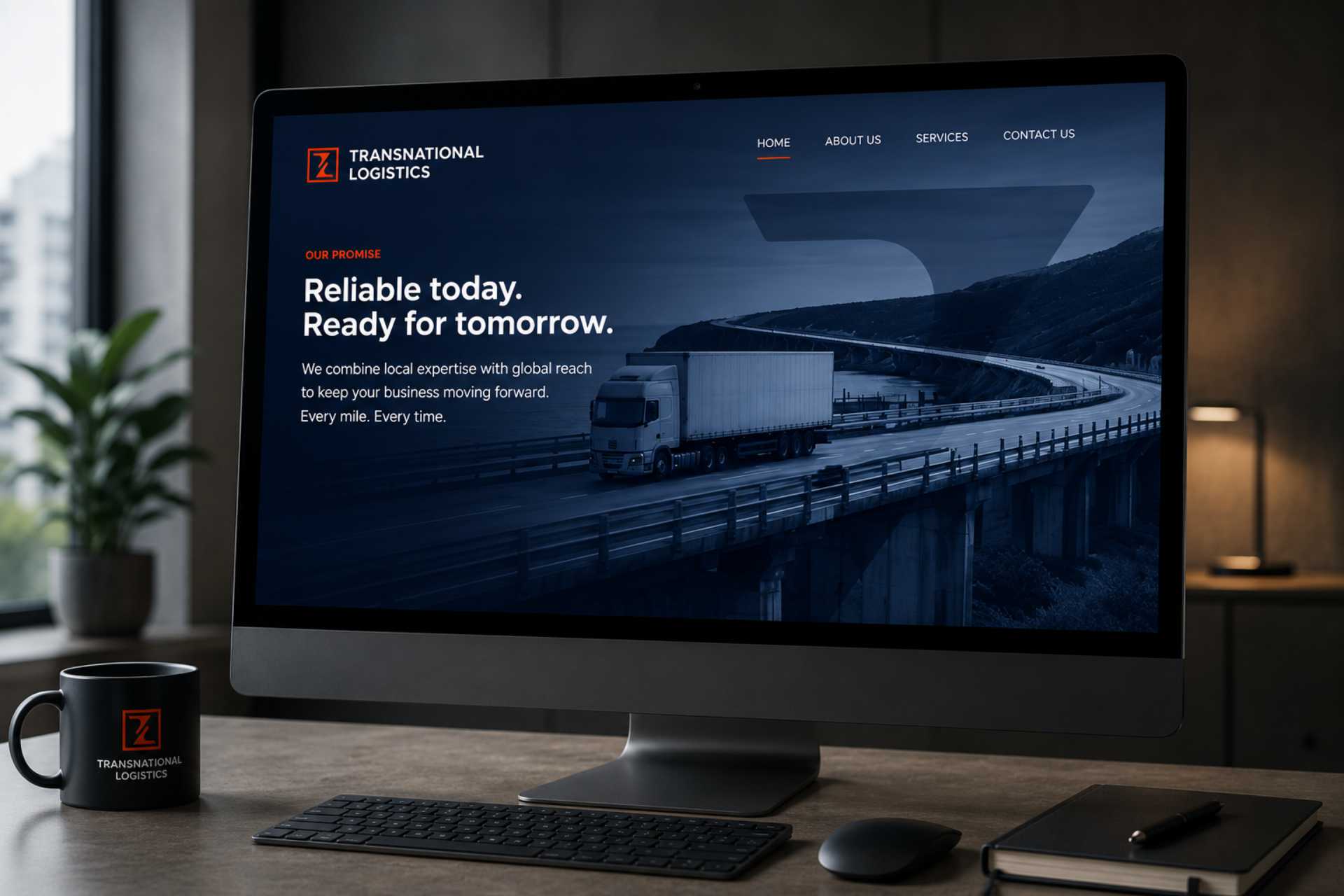
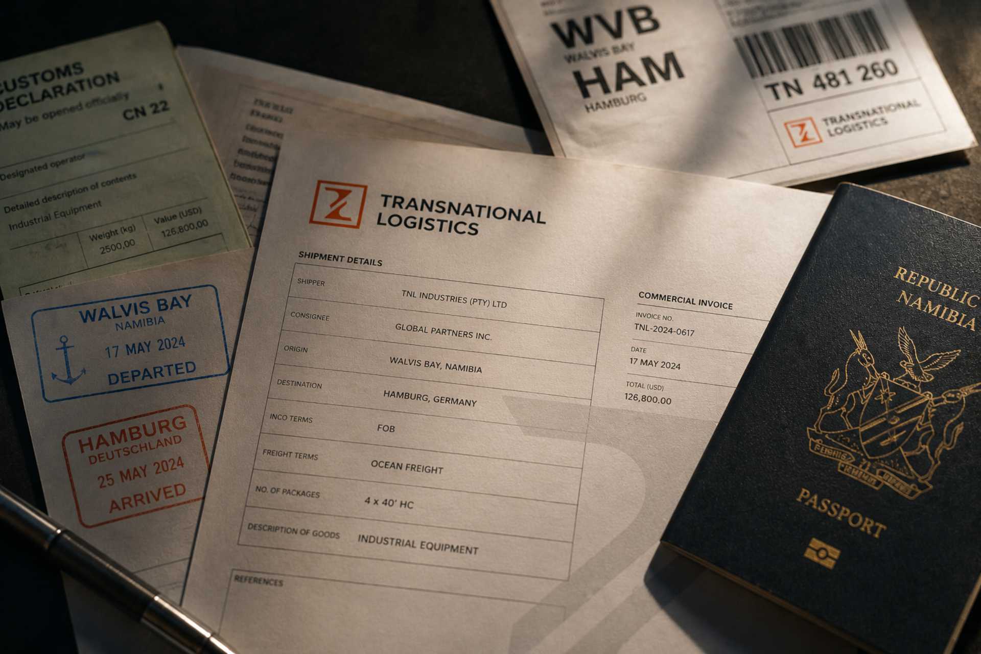
From there I built the brand out in full. A distinctive, functional logo that could hold its own on a container, a truck or a business card. A complete stationery system for the day-to-day paperwork that runs a logistics business. And a website that finally gave them a presence online, clear about what they offer and easy to point a new client toward.
Outcome
A brand that looks like everyone else is easy to forget. This one travels.
Transnational Logistics went from a borrowed-looking logo and no presence to a brand that travels with them, from the dockside to the inbox. One identity, working hard across every touchpoint, ready for whatever the next chapter brings.
Book a call and tell me where the business is going. I'll show you the clearest way to get there.
→Book a call